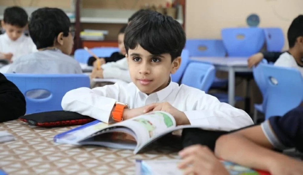
أعلنت وزارة التعليم الهوية البصرية الرسمية للعودة إلى الدراسة لتوحيد مخرجات الاتصال، وإبراز الهوية الموحدة في مختلف المبادرات والفعاليات. يعكس الشعار الذي اتخذته الوزارة تكامل جهود الأسرة والمنظومة التعليمية؛ لترسيخ الانتماء وتحفيز الشغف والابتكار لدى الطلبة. يوضح الدليل الإرشادي للهوية آليات الاستخدام والتطبيقات المعتمدة، التي ستستخدم عبر المنصات الرقمية والمطبوعات والأنشطة المصاحبة لانطلاق العام الدراسي الجديد.
يوفر الدليل إطاراً واضحاً لاستخدام العناصر بشكل ديناميكي وقوي، مع الحفاظ على قدر من المرونة التي تتيح تكييف الهوية بما يتناسب مع مختلف السياقات. يتألف شعار وزارة التعليم من مجموعة من الدوائر المتكاملة التي تتداخل لتشكل رمزية تمثل الكتاب والنخلة في توازن متناغم.
تم تصميم هذه الدوائر بأحجام وألوان متنوعة لتعكس عناصر رئيسية في العملية التعليمية مثل التكنولوجيا والمعلومات، وتجسد فكرة بناء فرد فاعل ومؤثر في المجتمع، قادر على الابتكار وتوظيف المعرفة ونقلها بفاعلية. ترمز هذه الدوائر إلى التفاعل والمشاركة المتناغمة في العملية المعرفية، وتم استلهام الخط العربي من الخط الكوفي، وصمم بنمط حديث يتكامل مع الشكل العام للشعار، مع مراعاة تصميم الخط الإنجليزي بنفس النسق لضمان الاتساق والتناغم بين اللغتين العربية والإنجليزية.
The Ministry of Education announced the official visual identity for the return to school to unify communication outputs and highlight a unified identity across various initiatives and events. The logo adopted by the ministry reflects the integration of efforts from families and the educational system to instill a sense of belonging and stimulate passion and innovation among students. The identity guideline clarifies the mechanisms for usage and the approved applications that will be utilized across digital platforms, printed materials, and activities accompanying the launch of the new academic year.
The guideline provides a clear framework for using elements dynamically and robustly, while maintaining a degree of flexibility that allows for adapting the identity to suit various contexts. The Ministry of Education's logo consists of a set of integrated circles that interconnect to form a symbol representing the book and the palm tree in harmonious balance.
These circles are designed in various sizes and colors to reflect key elements in the educational process, such as technology and information, and embody the idea of building an active and influential individual in society, capable of innovation and effectively utilizing and transferring knowledge. These circles symbolize interaction and harmonious participation in the knowledge process, and the Arabic script is inspired by the Kufic script, designed in a modern style that complements the overall shape of the logo, while ensuring that the English font is designed in the same style to guarantee consistency and harmony between the Arabic and English languages.